art, architecture & audience in motion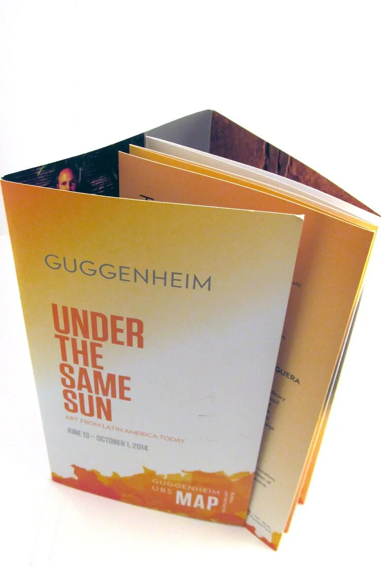
Collaborating with the Guggenheim’s in-house creative, agency of record, and marketing leaders, I helped develop and execute a direct mail campaign that bridged art, audience, and architecture. The work aimed to capture the museum’s global presence through design that was as thoughtful and timeless as the space itself—creating touchpoints that invited engagement and reflection, both locally and internationally.
Responsibilities:
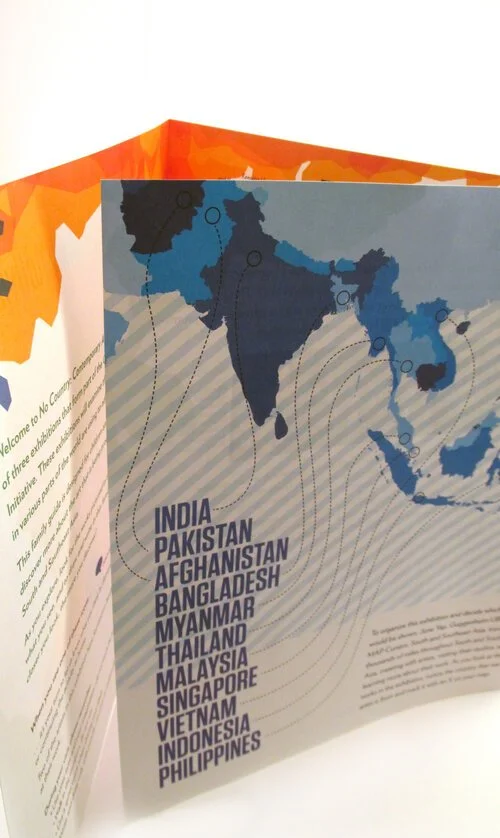
Served as Art Director in partnership with the museum’s Marketing and Creative teams and the agency of record. Led design and creative direction for integrated print campaigns promoting major global exhibitions. Oversaw freelance designers and guided production of visitor materials, including the Family Activity Guide and multiple rack cards for in-museum distribution.
Challenge:
The Guggenheim needed a cohesive promotional campaign that could connect its international exhibitions under a unified creative lens—one that reflected the museum’s iconic design legacy while appealing to contemporary art audiences. Each piece needed to honor the museum’s brand standards while maintaining flexibility to represent distinct global installations.
Approach:
I partnered directly with the museum’s marketing and agency teams to ensure creative alignment across strategy, design, and execution.
Directed design and production of a high-impact direct mail campaign introducing upcoming global installations.
Creative directed a freelancer to produce the Family Activity Guide, ensuring it reflected the museum’s educational tone while remaining visually engaging for visitors of all ages.
Developed a suite of rack cards for in-museum display, designed to integrate seamlessly with the museum’s established identity while supporting exhibition-specific storytelling.
Ensured all materials embodied the Guggenheim’s architectural precision, typographic sophistication, and modernist visual language.
Each piece was designed to feel tactile, intelligent, and immersive—reinforcing the museum’s philosophy of art as experience.
Outcome:
The campaign strengthened audience engagement, driving increased visitation and expanding awareness of the museum’s global programming. The Family Activity Guide became a key visitor resource, recognized internally for its clarity and visual appeal. The project reinforced the Guggenheim’s position as both a cultural icon and a forward-thinking brand—where creativity, education, and communication intersect.
